We may be compensated for your purchase of any of the products featured on this page – it helps us keep the lights on :)
If you want to track goal progress for things like paying off debt, donations raised, or weight loss using a goal thermometer in Excel can help keep you motivated.
You can make a goal thermometer in Excel in just a few steps.
The Scenario for this Example
In this article, we’ll go over how to make a goal thermometer chart to track how much debt is being paid off over the course of a year.
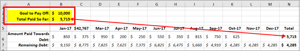
There is a goal of paying off $10,000 by the end of the year.
Each month, the debt is reduced by a different amount.
Create a Goal Thermometer in Excel
Watch: How to Create a Goal Thermometer in Excel – Tutorial
1. Organize Your Data
The first thing you’ll want to do is organize your data so that you can easily create a chart from it.
There are 2 key numbers that you will need for your goal thermometer chart. These are:
1. Your Goal Amount: This will be the total amount of debt you want to pay off
2. The Progress (so far): This will be a running total of what’s been paid towards the goal amount
Create a Chart
For the goal thermometer, you’ll need to create a Stacked Column chart.
To do this, highlight the Goal amount and the Progress total – including their labels. Then, to insert the chart, select:
- The Insert tab from your Ribbon
- Charts section
- Recommended Charts
- All Charts
- Column Charts
- Stacked Column Chart and
- Select the one that is stacked on top of one another*
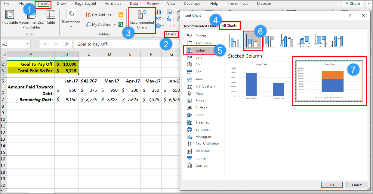
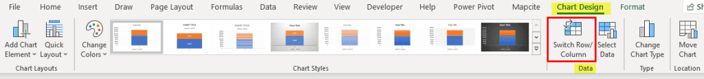
*If you don’t see the option to stack the totals on top of one another, don’t worry, just select the regular Stacked Column chart. After you insert the chart, go to Chart Design and, from the Data section, click Switch Row / Column.
2. Format your Chart
Once you’ve created your chart, you should see the Chart Tools options appear on your Ribbon.
It’s made up of 2 tabs:
- Chart Design
- Format
If you don’t see these, click anywhere in your chart area. These options are only available when your cursor is in the chart area.

3. Format the Thermometer’s “Temperature”
Check the Series Order
In this example, we’ll be using the Total Paid So Far series (aka, the Progress) as the “temperature” in the thermometer. This way, as we continue to pay more towards the debt, that column will rise.
For this to happen, Total Paid So Far needs to be positioned at the bottom of the stack.
The Goal amount needs be at the top.
If you need to switch these, in the Chart Design tab, click on Select Data, highlight either of the data series on the chart, and move them using the arrow. Click OK when done.
Update the Axes
Next, update the chart’s vertical axis. For this example, we’ll set it to $10,000 because that is the goal amount and is as high as we need for the “temperature” to rise.
To do that, select the vertical axis, right-click and select Format Axis.
Under Bounds, update the Maximum Bounds to 10,000.
To delete the horizontal axis label, select it and press Delete.
Color the Thermometer
While you can use any color you wish for your thermometer, red is ideal so that it resembles a traditional medical thermometer.
To make the thermometer red, select the Total Paid So Far series (the one on the bottom), right-click and click on Fill. Select a red. Select the same color for the Outline.
*If you don’t see the color options after right-clicking, select Format Data Series instead.
Under the Paint Can, select a Solid Fill and then pick a red from the color options.
Select the same color for the Border.
Next, select the Goal series (the one on the top), use the same tools as before to color the Fill and the Outline, but this time select:
- No Fill for the Fill
- The same red as before for the Outline
Change the Width of Your Goal Thermometer
You might want to make the chart width a bit thinner so that it looks more like a thermometer. To do this, right-click on either series, click on Format Data Series, then increase the Gap Width.
The Gap Width affects the space around each bar, making the bar thinner as it makes the gap between each bigger. For this example, let’s increase it from 150% to 350%.
Select or Deselect Chart Elements
For this example, I’d like to get rid of the chart’s legend and the chart title. There are 2 ways you could do this:
- You could either select each one and press Delete or
- In the Chart Elements options, uncheck the Elements you’d like to delete from your chart.
Create a Thermometer Bulb
To complete the thermometer look, you’ll want to create a bulb for your thermometer.
To do this, go to your Chart Tools, the Format Tab and, in Insert Shapes, click on the Oval.
Then, using your mouse, drag and draw an oval shape at the bottom of your thermometer. This creates the bulb.
Make sure to use the same colors for your oval as you did for your thermometer chart.
Want to Print your Goal Thermometer Chart?
If you want to print your thermometer chart, I think it’s easiest to print it if the chart is in its own sheet.
To move the chart to a separate sheet, right-click on the chart, choose Move Chart, then New Sheet. You may have to do some slight editing, but it will be sized for printing.
With your chart in its own sheet, simply press Ctrl+P to print the sheet.
Leave a Reply